Breaking News


Popular News


Learn the art of creating effective science fair posters by choosing the right layout, fonts, graphics, and color theory, while highlighting key data points. Are you preparing for a science fair and feeling overwhelmed by the thought of creating a visually appealing and informative poster? Don’t fret! In this blog post, we will explore the art of creating effective science fair posters by diving into the key elements that make them stand out. From choosing the right layout to incorporating engaging graphics and utilizing color theory, we will provide you with essential tips and tricks to make your poster a standout success. Crafting a visually captivating poster that effectively highlights key data points requires careful consideration of various components, including font selection and layout design. By the end of this blog post, you will be equipped with the knowledge and tools necessary to create a visually stunning science fair poster that effectively communicates your research findings. So, let’s dive in and explore the world of visualizing data through the art of creating effective science fair posters.
Contents

When creating a science fair poster, it is important to carefully consider the layout in order to effectively communicate your findings. The layout of your poster will determine the flow of information and the overall visual appeal. One key consideration when choosing a layout is to ensure that the most important information is prominently displayed and easy to locate. This means that the title, hypothesis, and key findings should be easily identifiable at first glance.
Another important aspect to consider when choosing the right layout is the overall organization of the poster. Utilizing a clear and logical flow of information will help guide the viewer through your project. This can be achieved through the use of headings, subheadings, and bulleted lists. By organizing your content in a systematic manner, you can effectively convey the purpose, methods, results, and conclusions of your project.
In addition to organization, the layout should also take into account the placement of any visuals or graphics. It is important to strategically place images, charts, and graphs in a way that complements the surrounding text. This will help create a visually appealing and engaging design that effectively conveys your data and findings.

Selecting Appropriate Fonts
When creating a science fair poster, one of the most important aspects to consider is the selection of appropriate fonts. The fonts you choose can have a significant impact on the overall readability and visual appeal of your poster. It’s crucial to choose fonts that are easy to read from a distance and also complement the overall design of your poster.
One key factor to consider when selecting fonts for your science fair poster is legibility. It’s essential to choose fonts that are clear and easy to read, even from a distance. Avoid using overly decorative or stylized fonts that may be difficult for viewers to read. Instead, opt for clean, simple fonts that are easy on the eyes and make your poster content easily digestible.
Another important consideration when selecting fonts for your science fair poster is cohesiveness. The fonts you choose should complement each other and contribute to a cohesive overall design. Consider using a combination of a sans-serif font for headings and a serif font for body text, or vice versa. This can help create visual interest while maintaining a cohesive look throughout your poster.
| Font Selection Tips |
|---|
| Choose fonts that are easy to read from a distance |
| Opt for clean, simple fonts |
| Use a combination of serif and sans-serif fonts for visual interest |
Ultimately, selecting appropriate fonts for your science fair poster is about finding a balance between readability and visual appeal. By choosing fonts that are easy to read and complement the overall design of your poster, you can create an engaging and effective visual presentation of your research.

Graphics play a crucial role in attracting attention and conveying information effectively. When creating a science fair poster, it is important to incorporate engaging graphics that are visually appealing and relevant to the topic. One way to achieve this is by using high-quality images and illustrations that capture the audience’s interest. Additionally, graphs and charts can also be used to present data in a visually appealing manner, making it easier for viewers to understand the information being communicated.
Another important aspect to consider when incorporating graphics is the use of appropriate placement to ensure that the poster is visually balanced. Graphics should be strategically placed to guide the reader’s eye through the content and highlight key points. By carefully arranging graphics, the poster can effectively capture the viewer’s attention and effectively convey the intended message.
Furthermore, it is important to consider the use of color and how it can enhance the overall visual appeal of the poster. The colors used in the graphics should complement the overall design and theme of the poster, creating a cohesive and engaging visual experience for the audience. It’s important to choose colors that are visually appealing and evoke the desired emotions or associations related to the topic being presented.
Overall, incorporating engaging graphics in a science fair poster is essential for capturing the audience’s interest and effectively communicating information. By using high-quality images, strategic placement, and thoughtful color choices, the poster can visually engage the audience and make a lasting impression.

When creating a science fair poster, one of the most important aspects to consider is the use of color. Color has the ability to evoke certain emotions and convey specific messages, making it a powerful tool in visual communication. It is essential to choose a color scheme that not only attracts attention but also effectively represents the content of the poster.
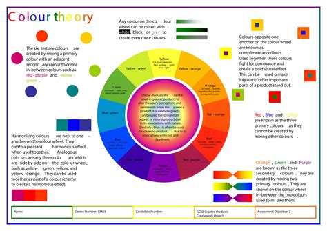
One way to utilize color effectively is by employing the principles of color theory. This involves understanding the relationships between different colors and how they interact with each other. For example, complementary colors, which are opposite each other on the color wheel, can create a vibrant and dynamic visual impact when used together. On the other hand, analogous colors, which are adjacent to each other on the color wheel, can create a harmonious and cohesive look.
Another important consideration when utilizing color theory is contrast. This refers to the difference between the lightest and darkest parts of the poster, which can make certain elements stand out and draw the viewer’s attention. By incorporating appropriate contrast, important information and key data points can be highlighted effectively.
Lastly, it is crucial to be mindful of the psychological effects of color. Different colors can evoke different emotions and associations, and understanding these effects can help in selecting the most appropriate color palette for the poster. For example, warm colors such as red and orange can convey energy and excitement, while cool colors such as blue and green can evoke a sense of calm and tranquility.

When creating a science fair poster, it is crucial to effectively highlight the key data points to grab the attention of viewers and communicate the findings of your research. One way to do this is by utilizing bulleted lists to succinctly present the most important information. By using bullet points, you can make the key data points stand out and easily scannable for the audience.
Another effective method for highlighting key data points is to use tables. Tables can be used to organize and compare data in a visually appealing way. This allows viewers to easily understand the relationships and patterns within the data. When creating tables, make sure to use clear headings and labels to guide the viewer’s comprehension and make the key data points easily identifiable.
In addition to bulleted lists and tables, it is essential to use color strategically to draw attention to the most important data points. By using bold or contrasting colors, you can direct the viewer’s focus to the key information. However, it is important to use color sparingly and purposefully, as too much can be overwhelming and detract from the overall effectiveness of the poster.

What are some key elements of an effective science fair poster?
Key elements include clear and concise title, organized layout, visually appealing graphics, and easy-to-read text.
How can data be effectively visualized on a science fair poster?
Data can be effectively visualized using graphs, charts, and diagrams that are easy to interpret and understand.
What are some tips for organizing and presenting data on a science fair poster?
Organize data in a logical sequence, use headings and subheadings, include captions for each visual element, and keep the layout clean and uncluttered.
What role does color play in creating an effective science fair poster?
Color can be used to help differentiate categories, highlight key information, and create visual interest, but it’s important to use it sparingly and thoughtfully.
How can students make their science fair poster stand out?
Students can make their poster stand out by using creativity in design, incorporating interactive elements, or adding a personal touch that reflects their passion for the project.
Why is it important to practice presenting the poster before the science fair?
Practicing the presentation helps students become more confident, refine their speaking points, and anticipate potential questions from judges or visitors.
Are there any online tools or software recommended for creating science fair posters?
Some recommended tools include Canva, Piktochart, and Adobe Spark which offer easy-to-use templates and design features for creating visually appealing science fair posters.